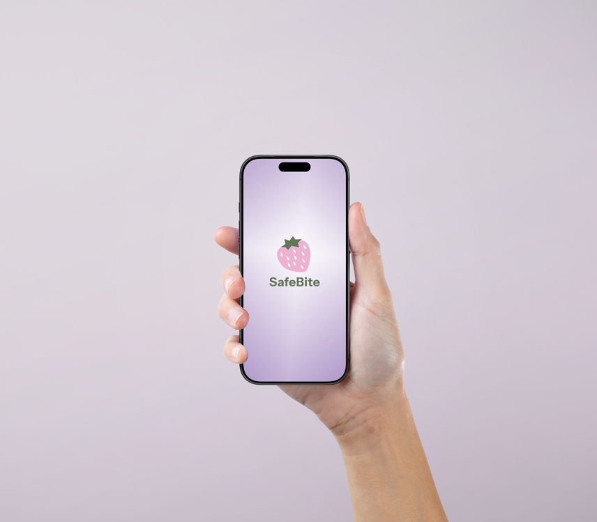
Outcome
Onboarding Drop-Off
Completion Rate
User Satisfaction
Problem / Solution / Deliverables
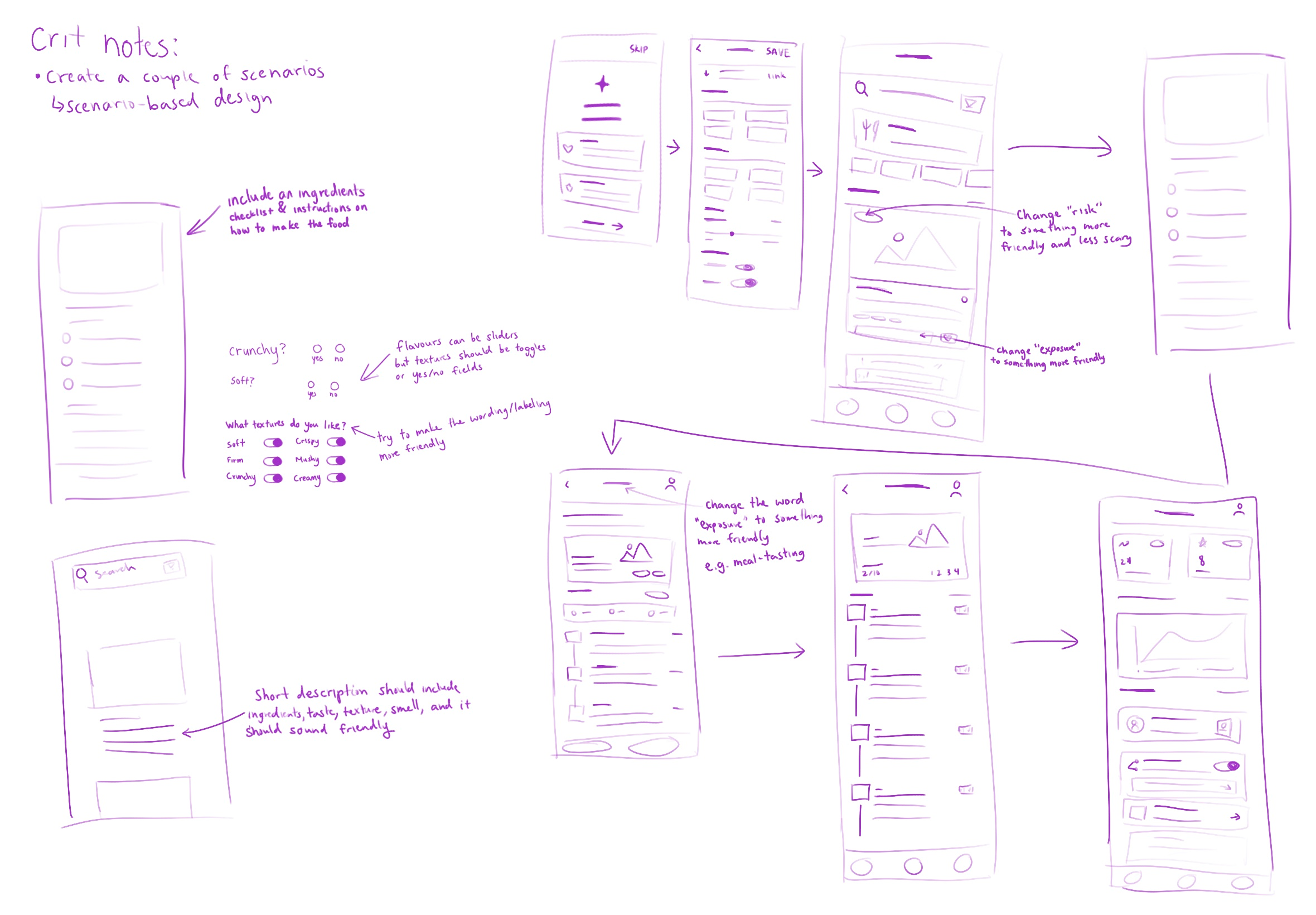
Problem
66% of users dropped during onboarding due to friction, formal labelling, and sensory overload.
Solution
Simplified step-based onboarding, ensured language used in labels were more gentle yet exciting, and introduced minimal UI elements.
Deliverables
User Research, IA, Sketches, Wireframes, High-Fidelity Prototypes, Usability Testing.
User Research
Participants
Pain Points
Usability Tests
Persona
Maya, 21 — Undergraduate Student With ARFID
Goal: Gradually try new food.
Frustration: Lack of resources for picky eaters and students with ARFID as well as minimal food options on campus.
User Story: "As a busy student, I want to be able to gradually explore new foods on campus through incremental steps."
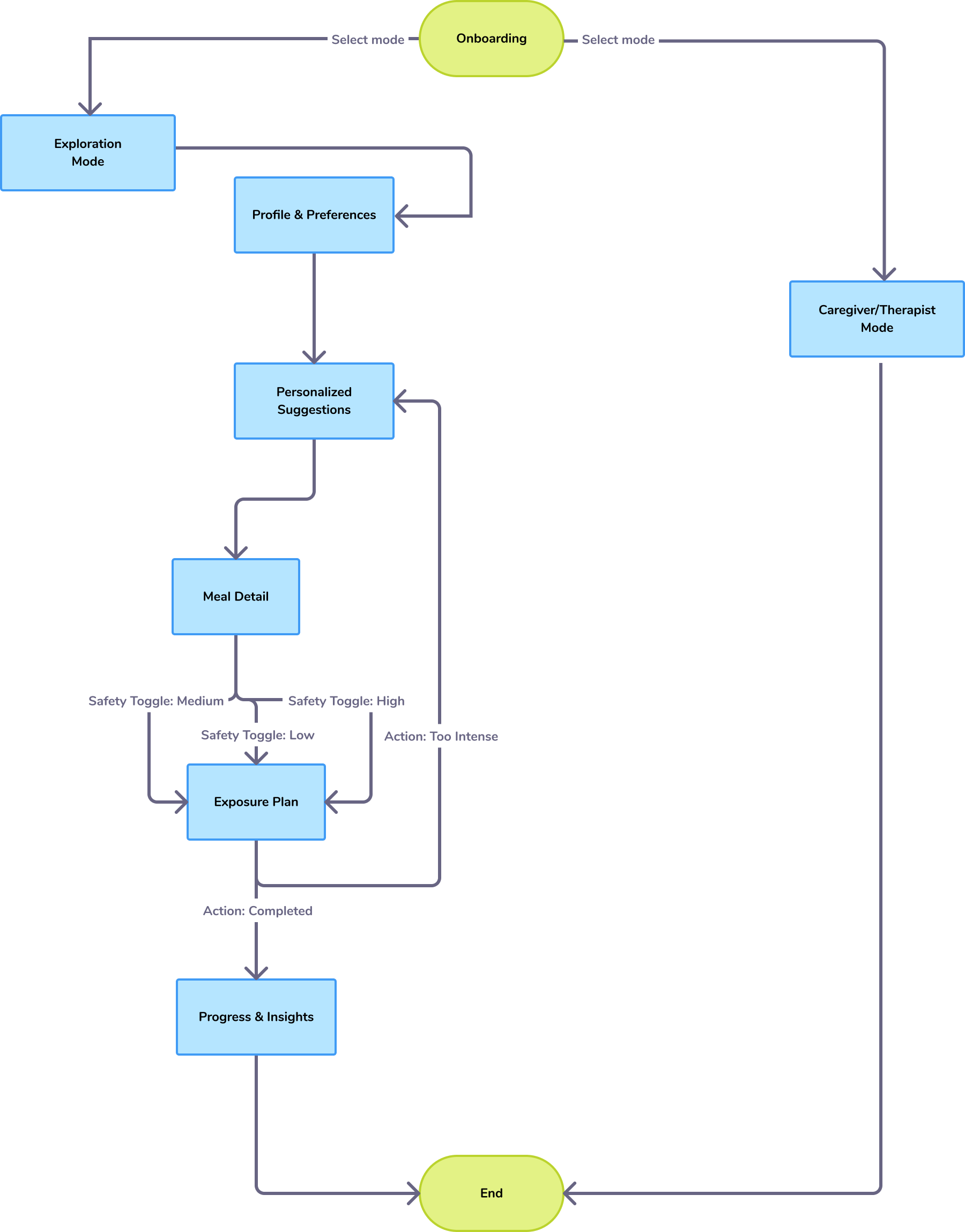
User Flow & IA
Sketches
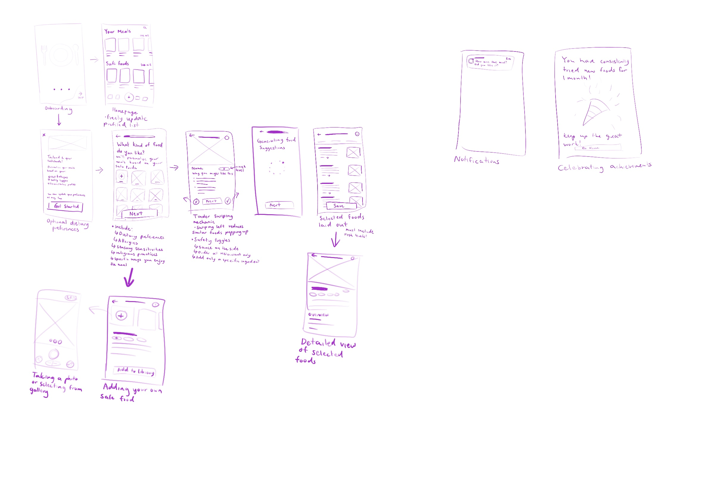
Mid-Fidelity Wireframes

User Testing Iterations
Before
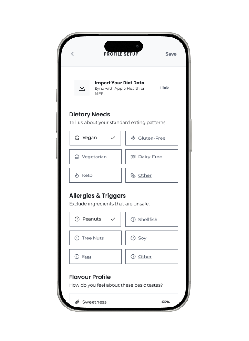
Although icons made the design more visually pleasing, it created hesitation.
After
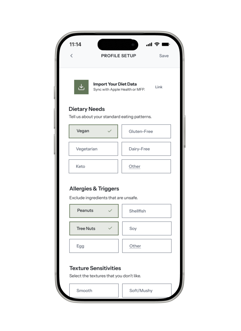
Removing icons reduced cognitive load and increased clarity. Additionally, similar items are grouped together to enhance logical flow.
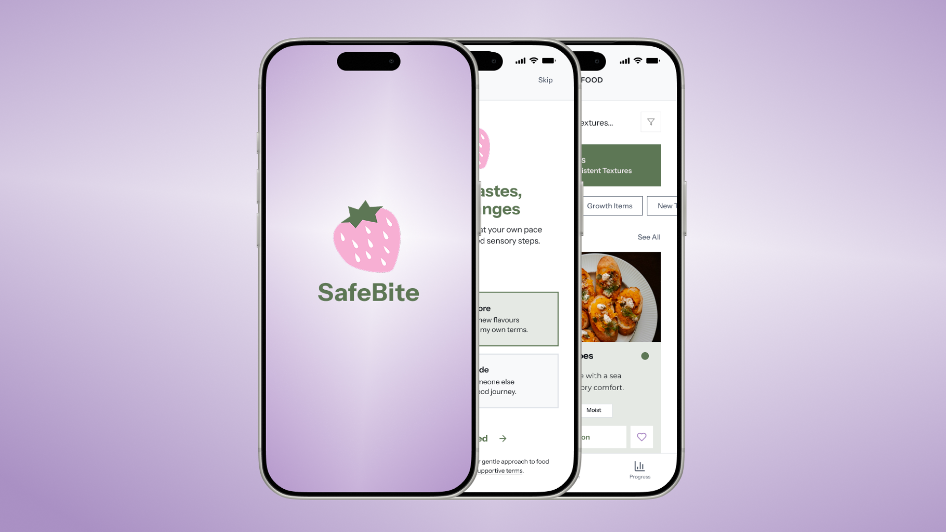
Final Prototype
Reflection & Impact
This project reinforced that simplicity builds trust, especially for people with sensory sensitivites, who can experience sensory overload when interfaces are crowded with too many functions or icons.
By reducing visual noise and focusing on clear, predictable interactions, the final design created a calmer, more accessible experience.
This led to measurable improvements in usability and helped users feel more confident and in control. It reinforces why accessibility matters. Thoughtful, inclusive design does not just accommodate specific needs, it makes the experience better for everyone.